Visuals

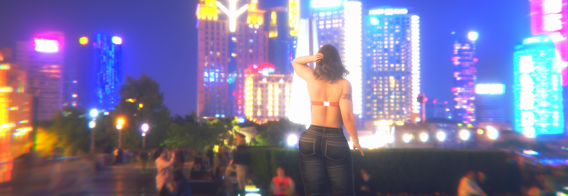
Hey all, I have updated to HS2 from Ai and thought I was improving on the models and lighting but now I am second guessing myself. On the discord under #hotwife-game-pics (don't want to post pics here on Patreon) I have uploaded a couple pics from the current scene I am working on as well as a similar one from the prologue. Pic B is the lighting I am currently using for a "bedtime" scene however I am starting to think the light in Pic A is better? Please have a look at the photos when you have a moment and send your thoughts. I will also upload some other images that I am unsure about (mostly how I lit them). Too dark? Do you prefer the more stylized lighting?
I will be uploading what I have of Chapter 1 for Patrons today or tomorrow (likely tomorrow). As mentioned I am working on visuals but all the writing and coding has been completed. There will be some slight changes once I release the finalized Chapter 1 but they will be fairly minor (grammar, spelling, rephrasing).
Thanks again for all being here, I appreciate it!
Discord link for those who need it. :)
Get The Hotwife
The Hotwife
A couple starts exploring non-monogamy and the Hotwife lifestyle
More posts
- No longer in developmentJan 14, 2025
- October UpdateOct 23, 2024
- September UpdateSep 11, 2024
- April UpdateApr 02, 2024
- Bonus Content #3Mar 24, 2024
- Chapter 3 release!Mar 14, 2024
- CrunchMar 04, 2024
- Mid Feb - Small working update.Feb 21, 2024
- Feb 2nd updateFeb 02, 2024
- Happy New YearDec 31, 2023

Leave a comment
Log in with itch.io to leave a comment.